Deprecation Mode
Driving component adoption by reducing legacy component usage.
As our design system matured, we rolled out improved components to reflect new visual direction, accessibility standards, and updated patterns. However, outdated components lingered in feature team files. We needed a way to signal deprecation and guide designers toward the new components.
Timeline
March 2025
Toolkit
Figma
Team
Solo project.
Role
I led the concept of this project and brought it to life!
How It Works 01
Creating a deprecation mode variable collection
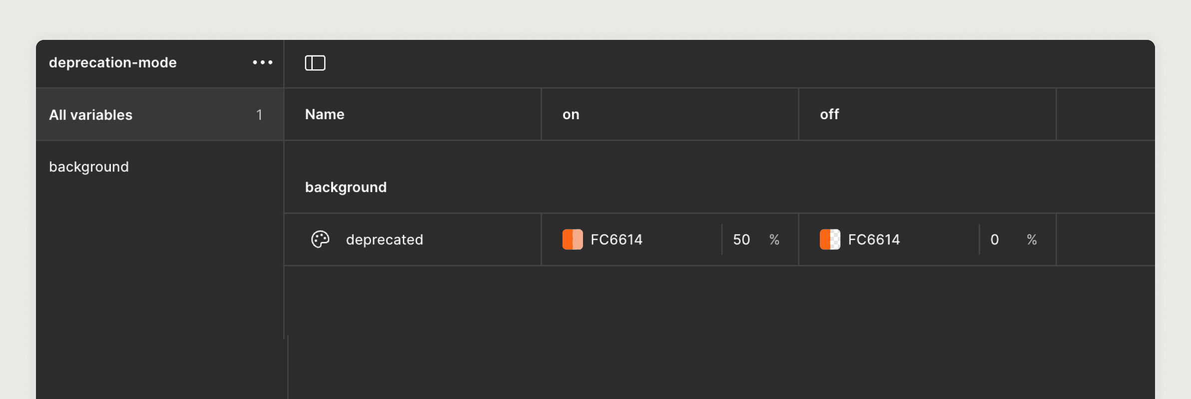
I created an unpublished variable collection called {deprecation-mode}. This allowed us to control the visibility of deprecation styling on the page level.
How It Works 02
A tinted overlay to visually distinguish deprecated components
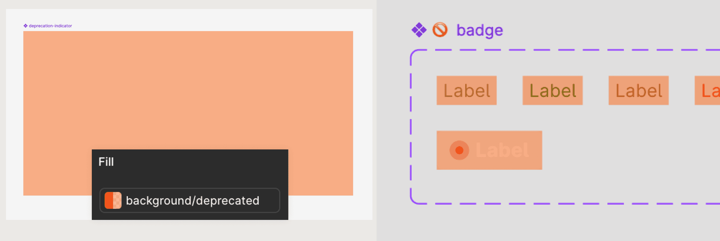
To make deprecated components easy to spot in files, a {deprecation-indicator} component that acts as a color overlay within deprecated components was created. The previously made deprecation token (background-deprecated} is applied to this component.
How It Works 03
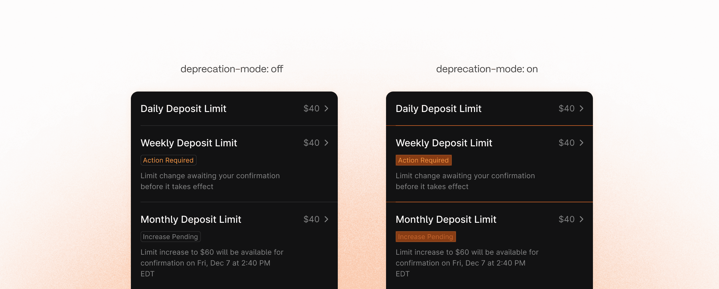
Feature teams are able to visually spot deprecated components within their files
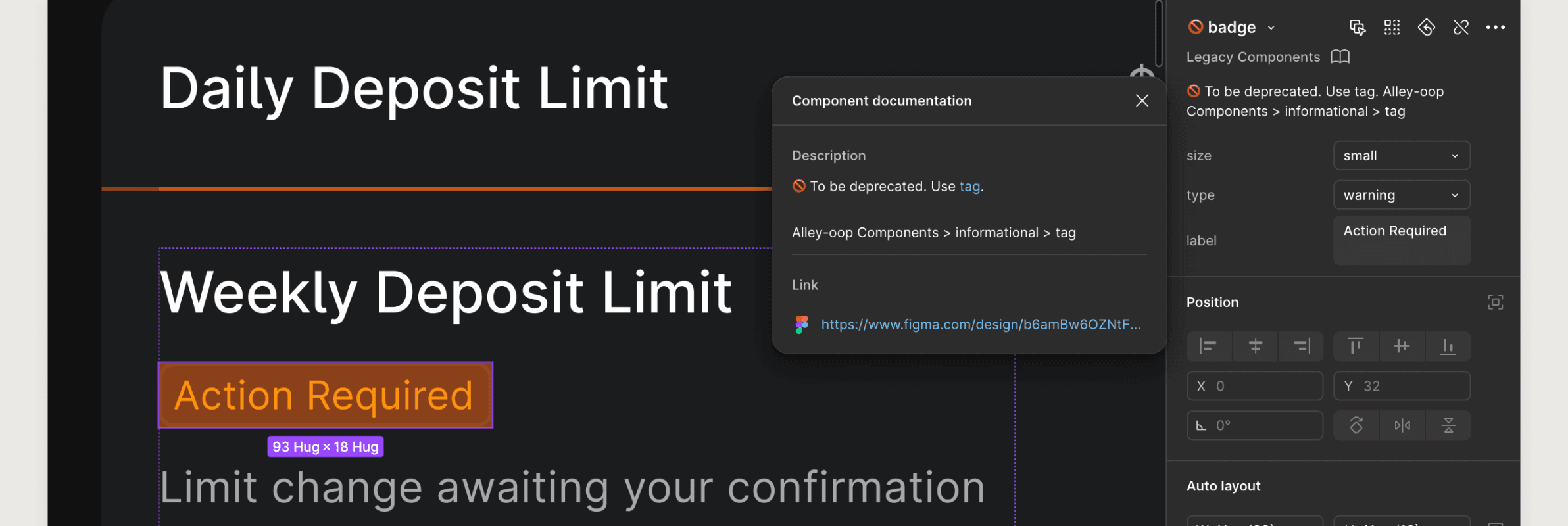
Deprecated components are easy to see with the deprecation indicator visible. Furthermore, component descriptions are used to navigate designers to the new replacement component.