Refactoring Buttons
ESPN BET, theScore BET
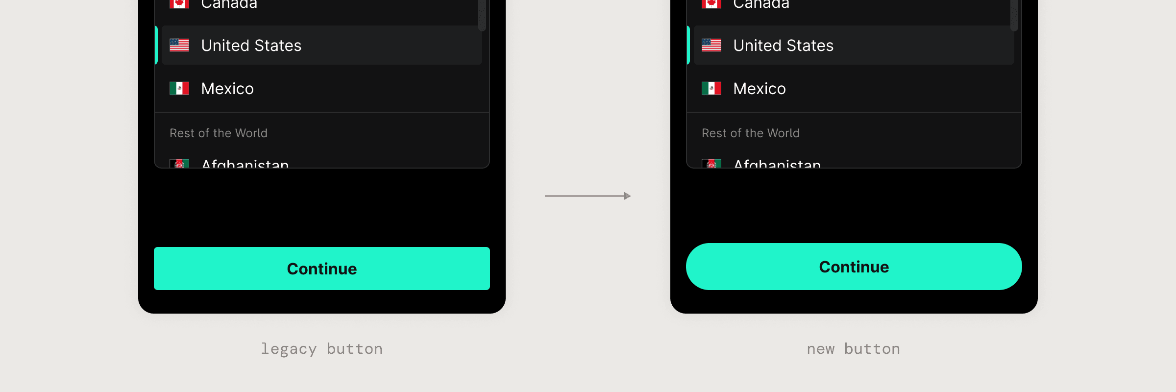
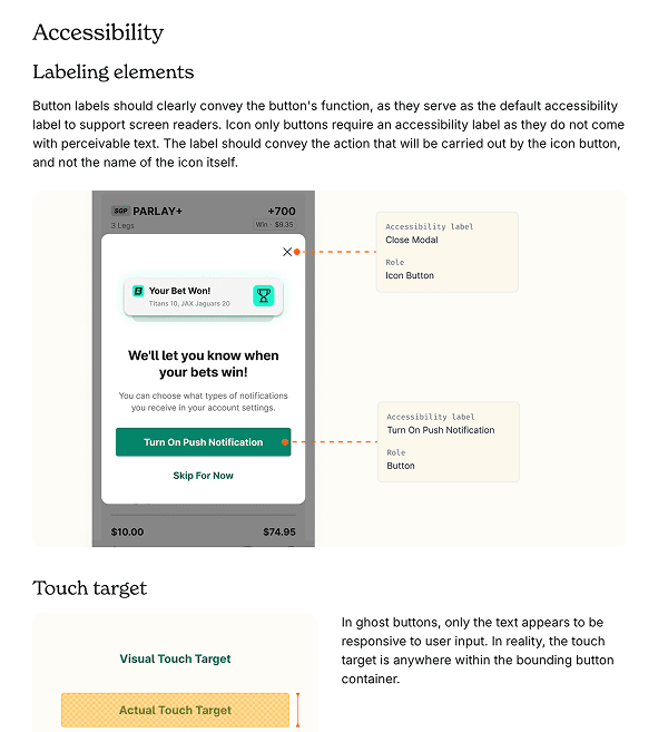
Buttons! Small in size, big in impact. They guide actions, drive conversions, and carry the weight of brand voice. But, our legacy button had became one of the most chaotic components within the system. We refactored the button from the ground up, to clean up visual inconsistencies but also to rethink how it can scale across multiple brands and platforms.
Timeline
February - April 2025
Toolkit
Figma, Supernova, GitHub, Storybook, Jira, Protopie
Team
One designer, three software developers, one design manager, one engineering manager, one QA, and one product manager.
Role
I led the end-to-end refactor of the button component. From auditing legacy buttons to defining the new design pattern and driving adoption across multiple feature teams.
At a glance
Reduced color token bloat
Reduced one-off color tokens by 41%, going from 61 button-specific tokens to 36 reusable tokens.
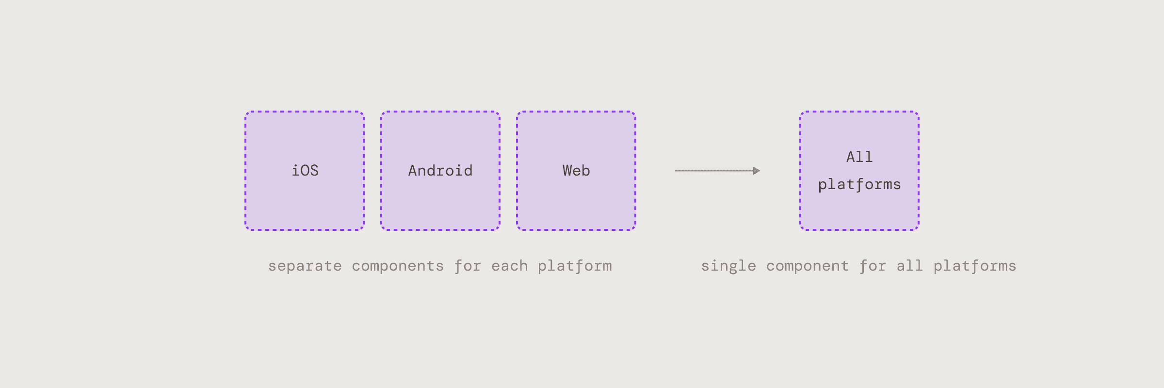
A single Cross-platform component
Replaced 3 platform-specific sets with 1 unified component, making it easier for designers to use and for us to maintain in Figma.
Multi-Brand Support
Introduced a border token specific to the button component, enabling multiple brand styles without duplicating components.
High Adoption Rate
With built-in support for nearly all existing button use cases, the new component has replaced legacy variants in 90% of product flows.
A Deeper Dive
Audit & Research
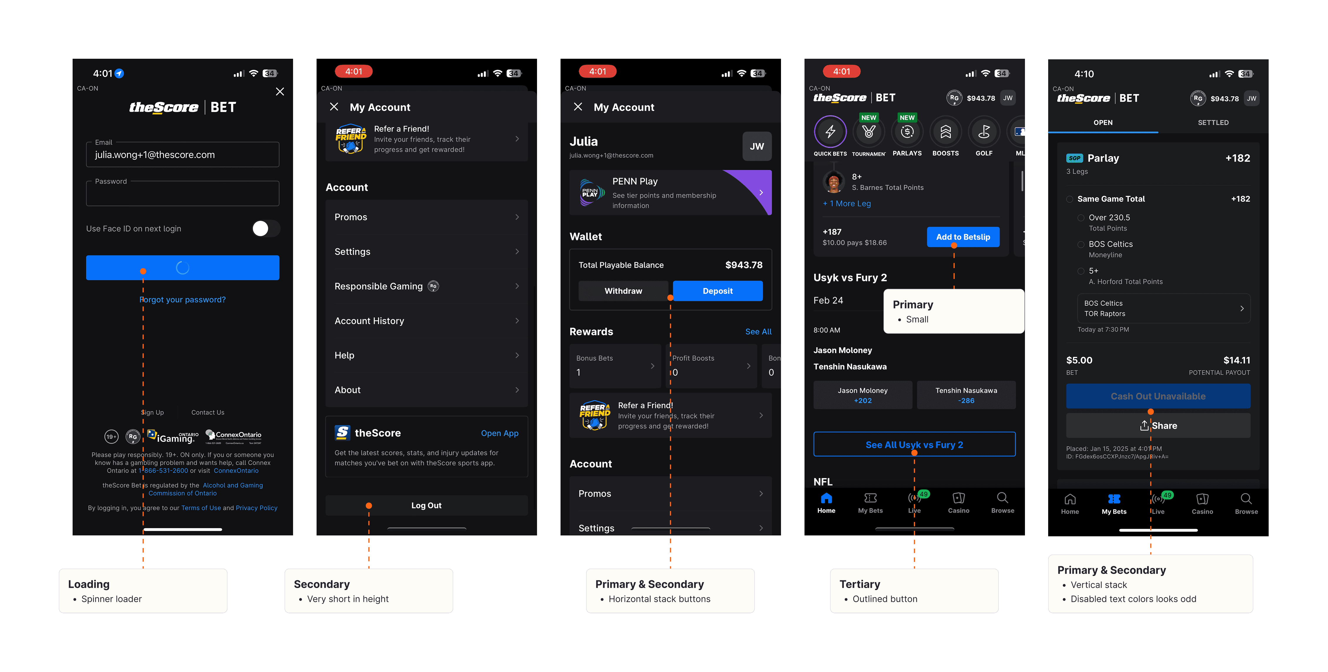
I gathered production screens and began annotating them to identify how buttons were styled and used across different flows. This helped uncover existing patterns, inconsistencies, and edge cases that needed to be addressed.
Finding 01
Inconsistent visual hierarchy
Each brand had its own version of secondary, and they didn’t always map to the same semantic meanings. This made the experience feel inconsistent across products and confusing for designers and developers.
Finding 02
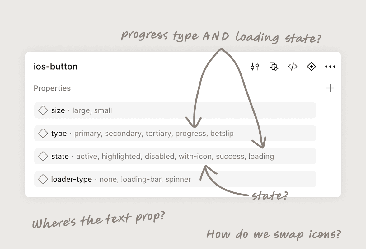
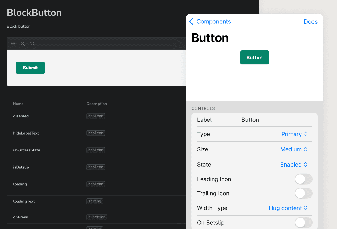
Messy and unstructured props
The property panel in Figma was confusing. The naming was not clear, and designers found a hard time configuring to the desired type and state, ultimately detaching instances to customize them.
Finding 03
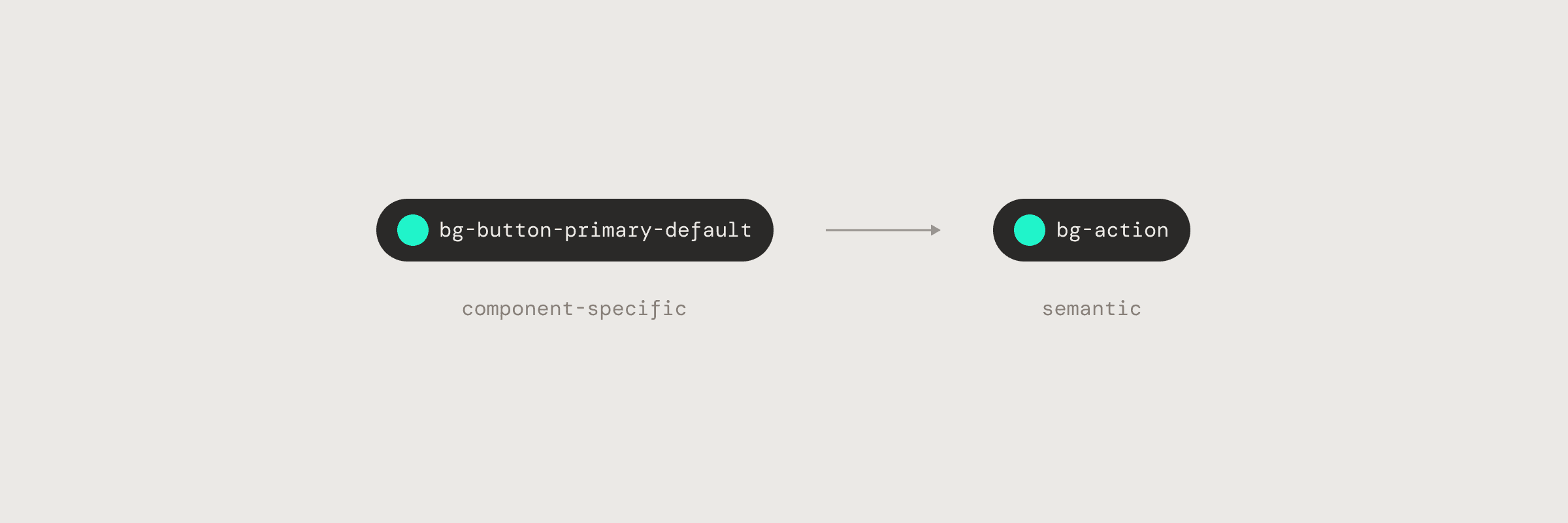
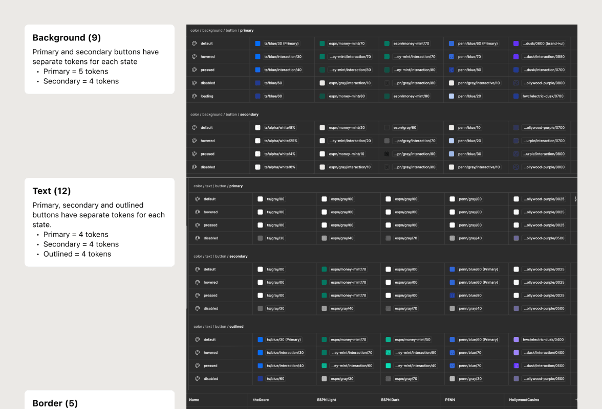
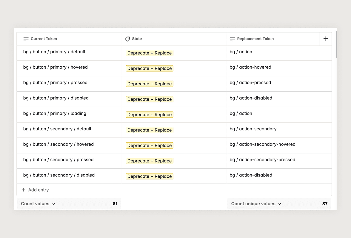
61 color tokens, just for buttons
We had a 61 non-reusable colors tokens specific to the button component, meaning these tokens were most likely only used once. This contributed to our larger issue of color token bloat.
Finding 04
Buttons were not reusable in code
There were close to 100 individual button implementations scattered across the codebase on all platforms. Maintenance was painful, consistency was difficult to achieve, and updates were impossible to scale.
The Challenge
Our legacy button system was… a bit of a mess. Properties and color tokens were all over the place, each platform had its own component, and worst of all? The button didn’t actually exist as a shared component in code.
The goal
We wanted to build a button system that is reusable, easy to maintain, and scalable. One that works across all brands and platforms, for both design and development.
Introducing
Improvement 01
Standardizing button hierarchy across all brands
We created a clear structure for primary, secondary, and tertiary buttons. These roles were visually distinct, helping teams make better decisions faster.
Improvement 02
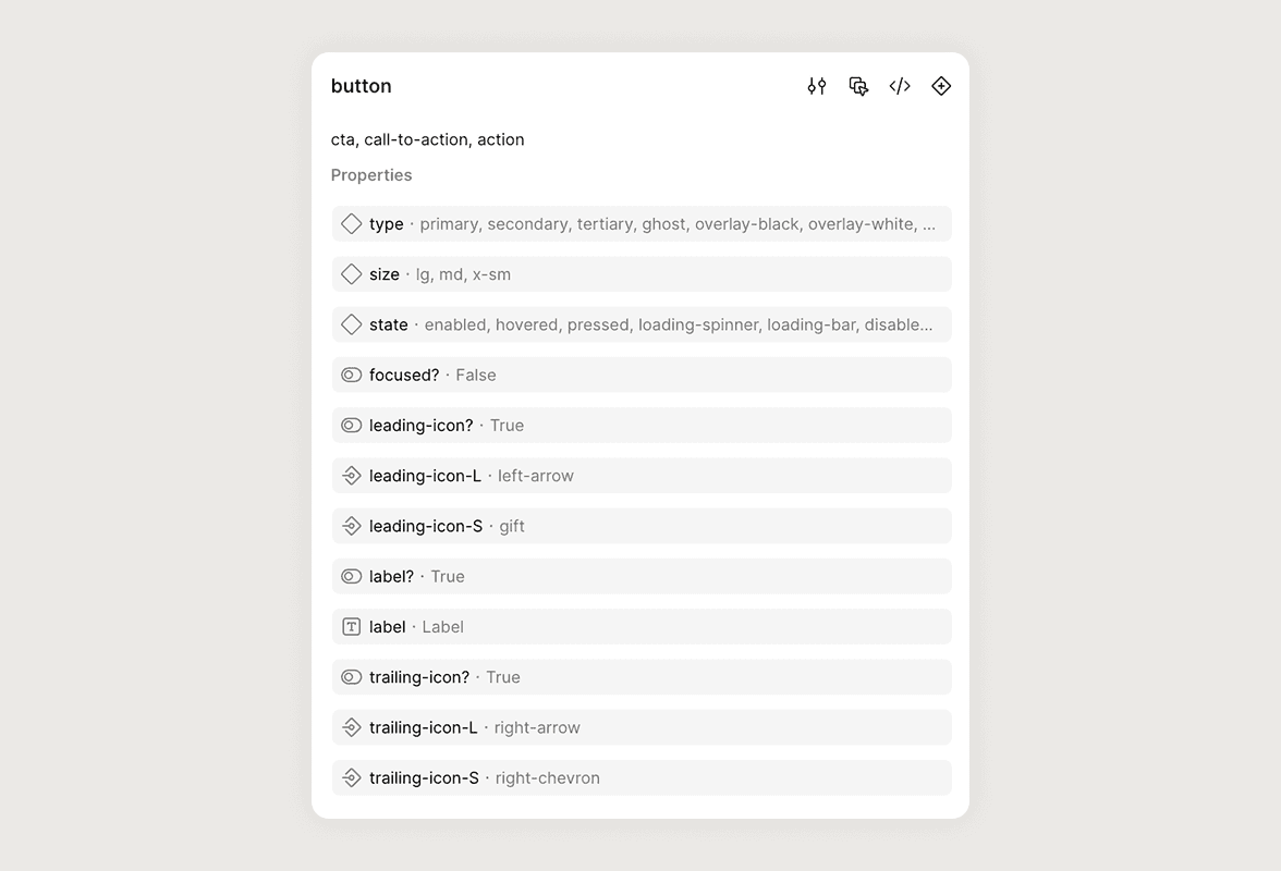
Props that are easy to configure
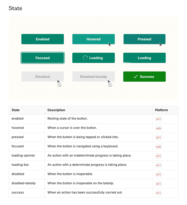
The component now uses intuitive, organized props — including state, size, icon placement, and text.
Improvement 03
Reduced one-off tokens by ~41%
We deprecated our bloated set of button-specific color tokens and replaced them with a more generic, semantic system. As a result, we went from 61 one-off tokens to 36 reusable tokens that can apply to different components!
Improvement 04
A single reusable component in code
The button component now lives in the codebase as a single source of truth. It’s easy for feature developers to use, and the props closely mirror what’s in Figma, making design-to-dev handoff seamless. This alignment streamlines workflows, reduces custom overrides, and saves teams valuable time.
Improvement 05
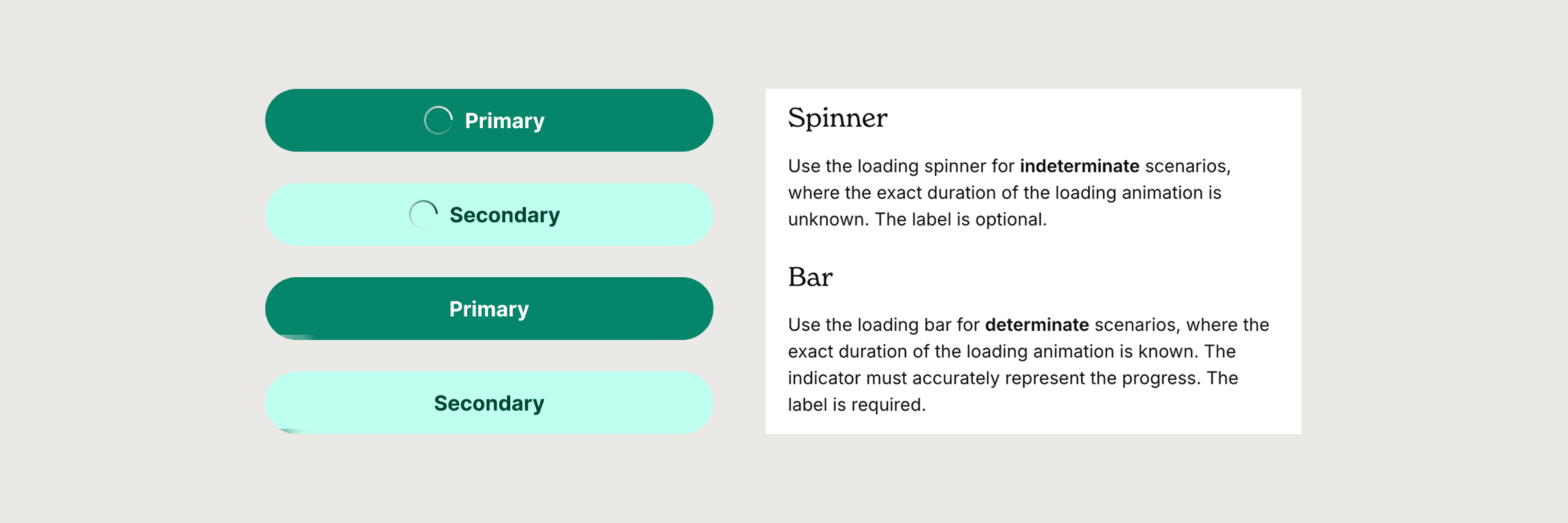
Defining loader types
I introduced clear guidelines and logic for loading states. Indeterminate (e.g., spinners) for uncertain timing like form submission; determinate (e.g., progress bars) for known durations like uploads.
Documentation
Usage guidelines were created and published on our internal documentation site, making it easy for designers and developers to implement the new component consistently.
Reflection
Lessons Learned
⛅️
Aim for progress, not perfection
We didn’t launch with every possible variant. Instead, we built a strong core and left room for evolution. It’s better to ship something useful and improve it, than aim for a perfect v1.
🧰
Tools only get you halfway
Figma Dev Mode and Storybook helped a lot, but they didn’t replace the need for actual conversations. I made sure to collaborate with the developers on the team closely, chatting even about the smallest details.