Alley-oop Design System
Building unity through a multi-brand, platform, and product design system.
Alley-oop is a design system that spans 4 brands, 4 platforms, and 4 products. It was created to help feature and platform teams build effective products quicker, through providing them with tokens, components, and comprehensive guidelines.
Timeline
Since 2023
Toolkit
Figma, Supernova, GitHub, Storybook, Jira
Team
Three designers, eight developers, one design manager, one engineering manager, one QA, and one product manager.
Role
My responsibilities ranged from building design tokens and design guidelines during the early days of the system, to building reusable components with our fellow developers and vouching for adoption. Additionally, I worked closely with feature designers to support their needs.
The Libraries
Foundations
All of our core tokens—like color, text, border, spacing, and more—live in a shared file called Foundations. We use an automated script that syncs Figma variables directly to GitHub, so any updates in design are instantly reflected in the codebase. This seamless connection keeps everything in sync and is a big reason why we’ve achieved 100% adoption of tokens across teams!
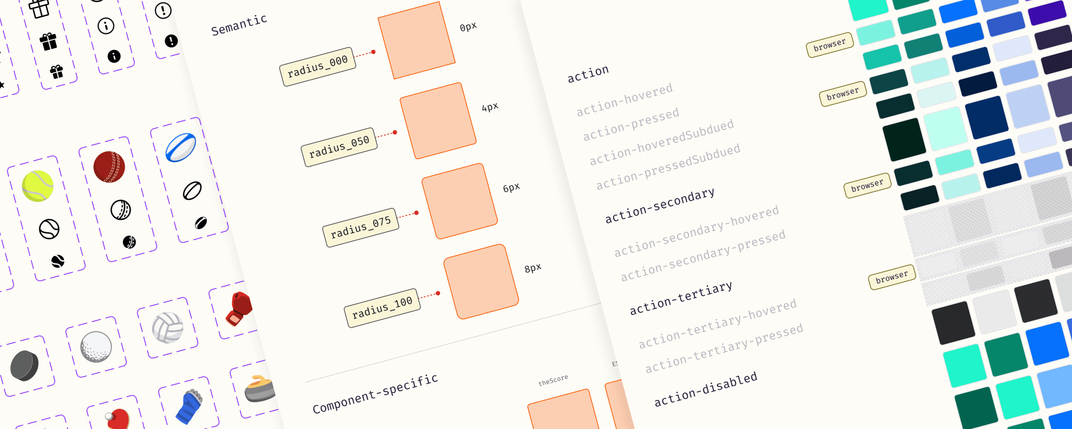
Foundations
A single color token collection that works across multiple brands
Our color token system makes it easy for feature teams to switch between brands. Semantic and component-specific tokens like {bg-offset}, {text-primary}, {text-action} are utilized to achieve this. This also makes it simple to roll out new brands, which happens quite often!
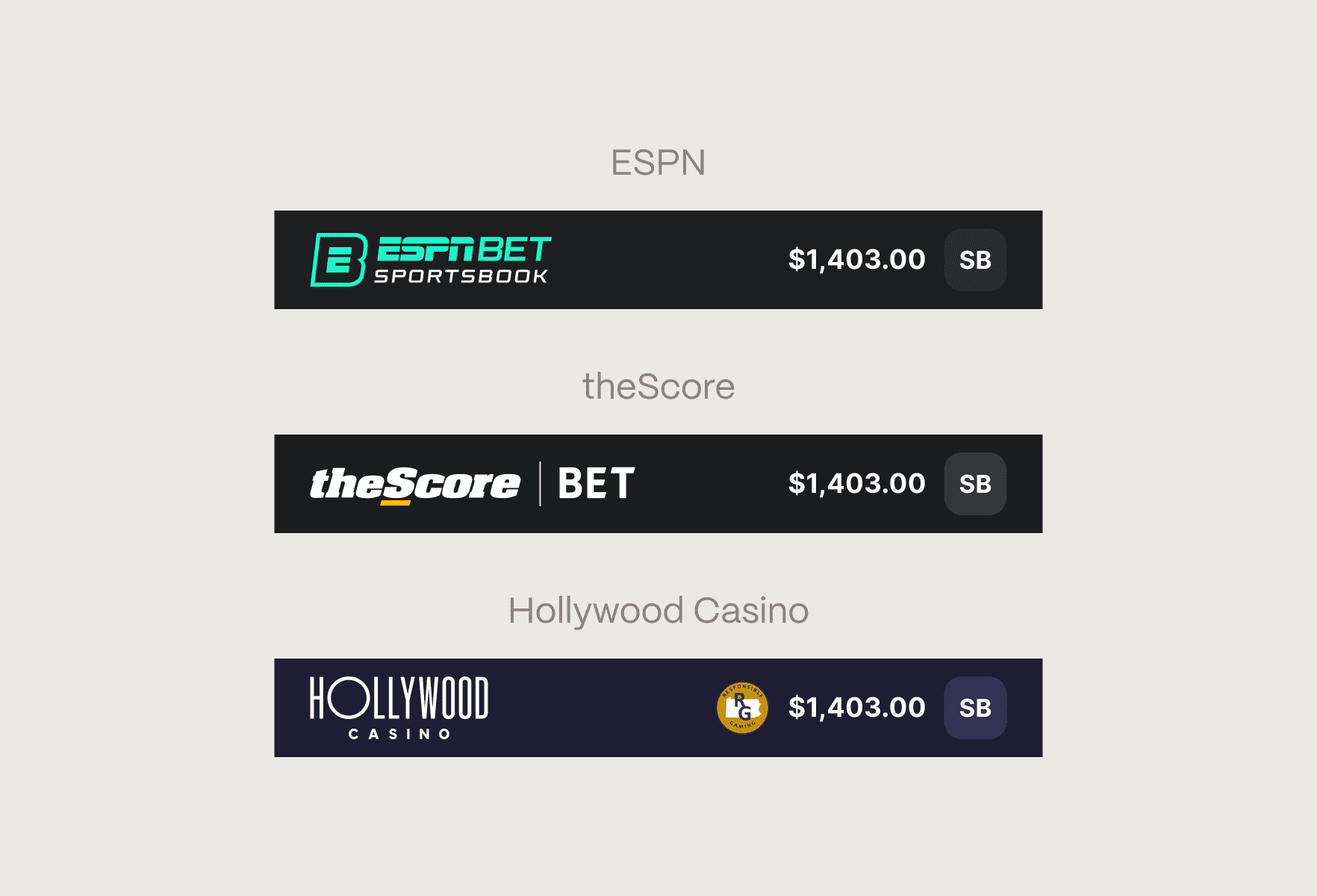
Foundations
Supporting brand-specific graphics at with boolean variables
In addition to color, some components need to display different logos depending on the brand. To handle this, we introduced boolean variables tied to each brand, allowing components to conditionally render the correct assets. So when a brand theme is applied, the logo and other visuals update automatically alongside the color tokens.
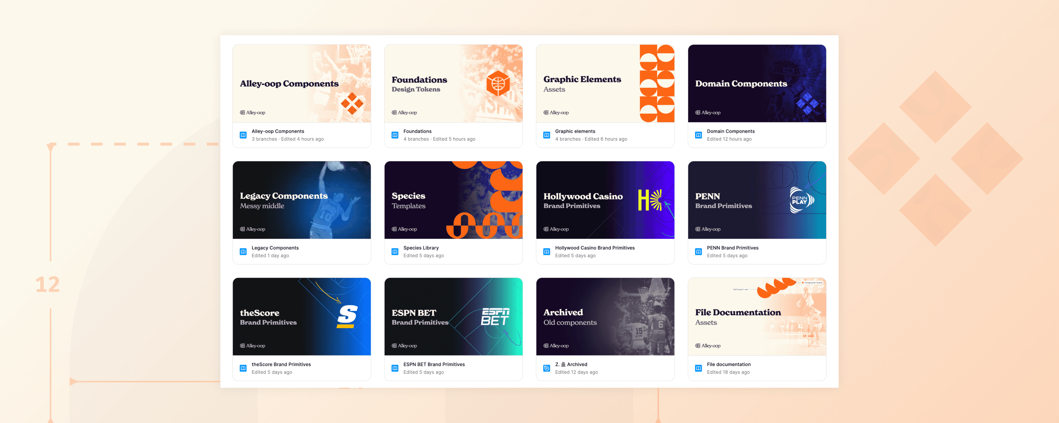
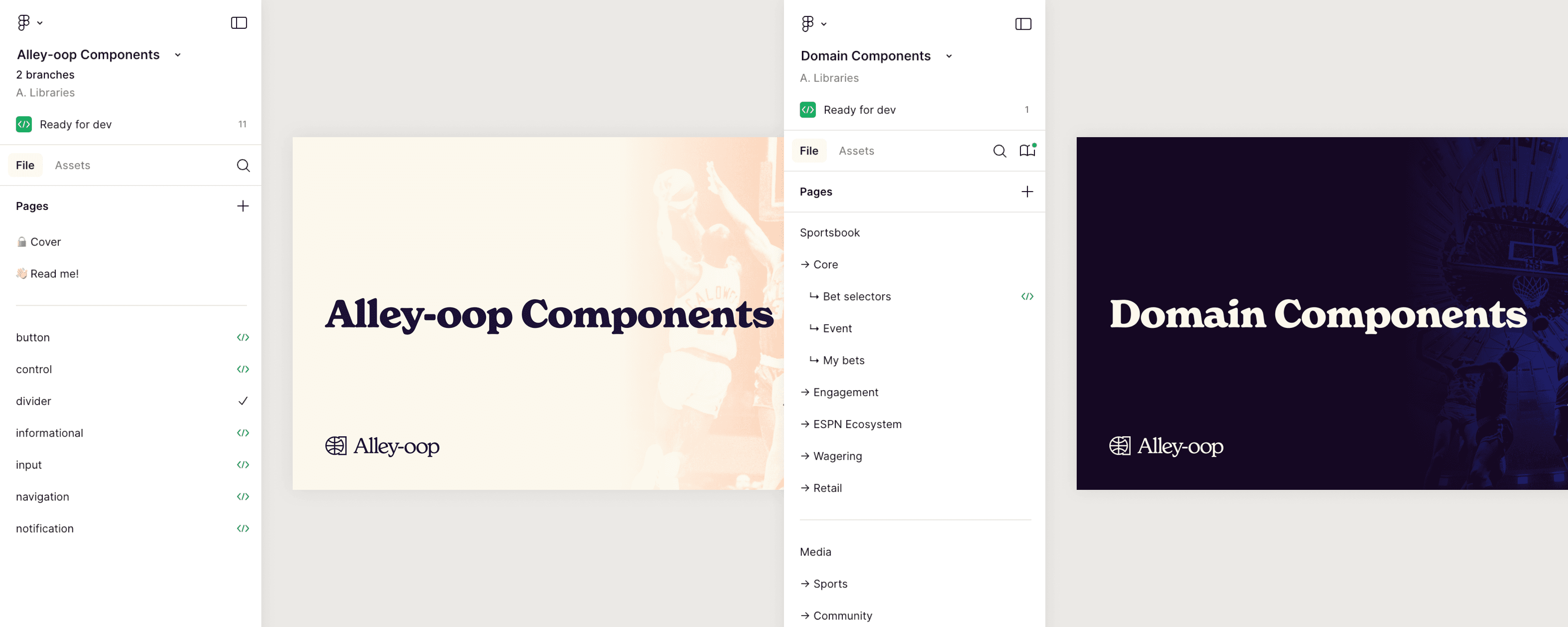
The Libraries
Components
Alley-oop is split into two component libraries: Alley-oop Components, managed by our team, and Domain Components, owned by feature teams. Alley-oop holds core, code-backed components, while Domain contains feature-specific ones. This setup gives teams the freedom to build with flexibility, while still benefiting from a shared foundation.
Components
A peek into some of our components
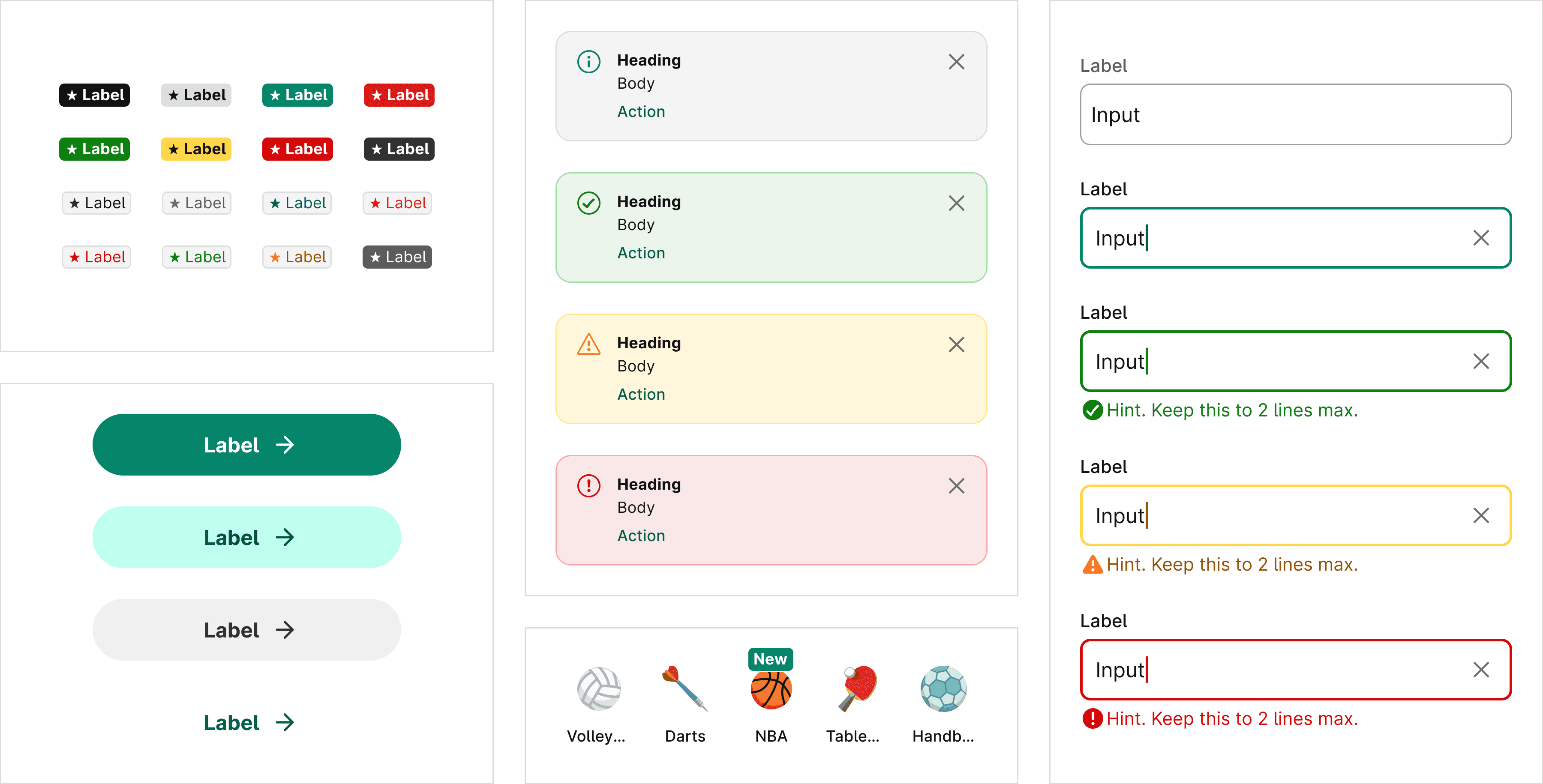
All our components are built to be reusable, accessible, and work across multiple themes. We're currently in the process of rebuilding legacy components to align with these standards, so there's much more to come!
Components
Making it easy for feature developers with Figma’s Code Connect
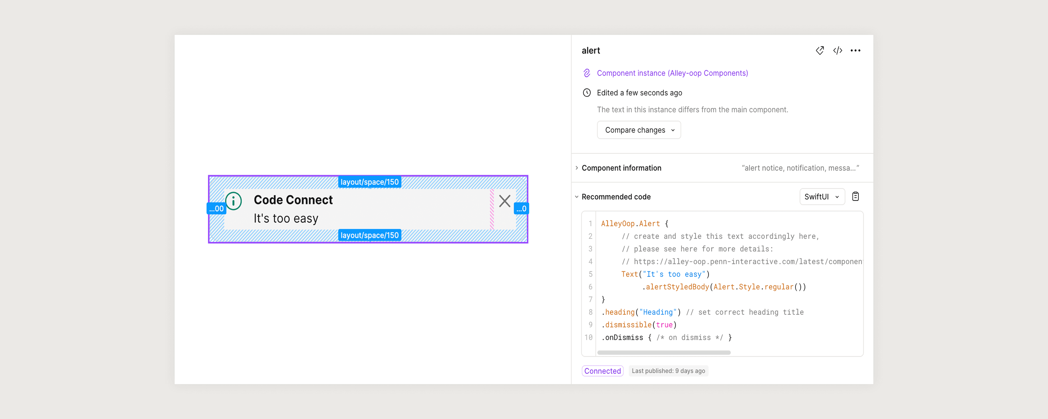
All core components take advantage of Figma’s Code Connect. This way, feature developers can quickly see whether a component in Figma exists in the codebase. We support this across all platforms, including SwiftUI, Compose, and React.
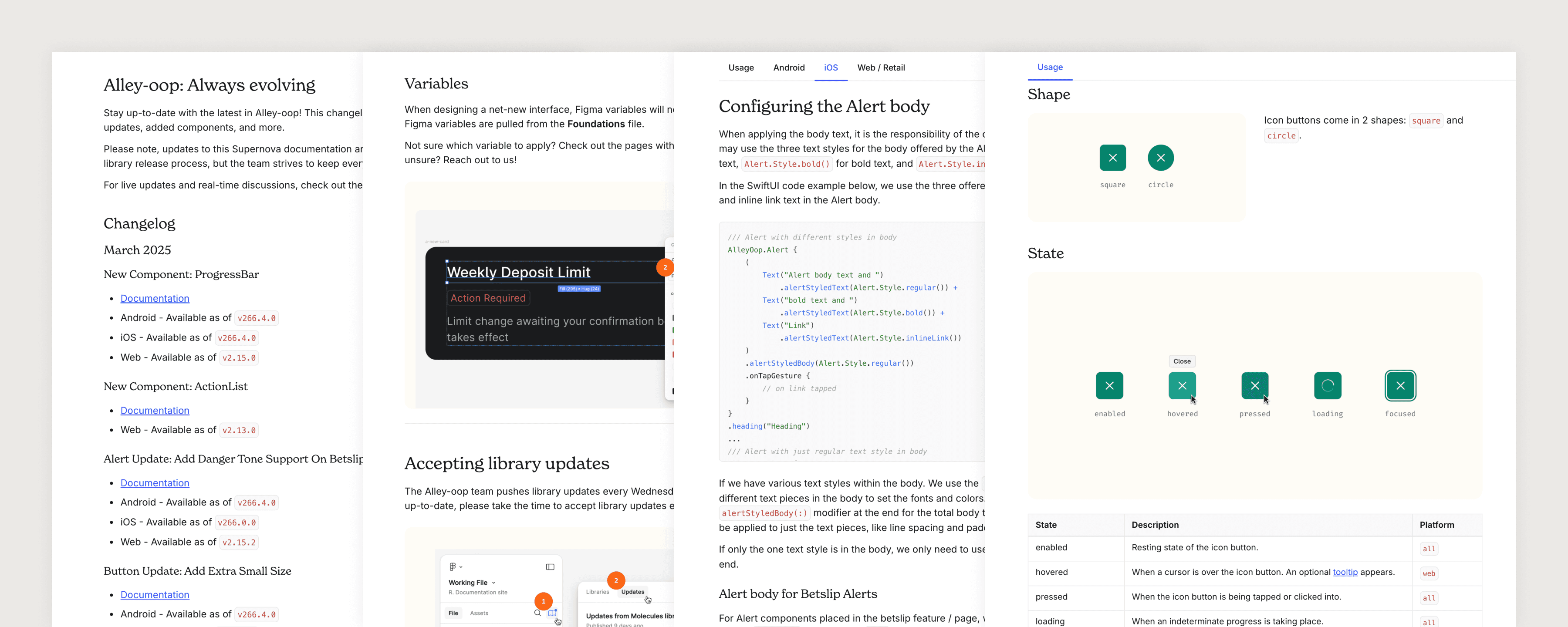
Documentation
Alley-oop Doc Site
The Alley-oop documentation site — powered by Supernova — is our single source of truth for design and development. It includes foundational guidelines, reusable components with usage instructions and code snippets, accessibility standards, implementation best practices, and more.
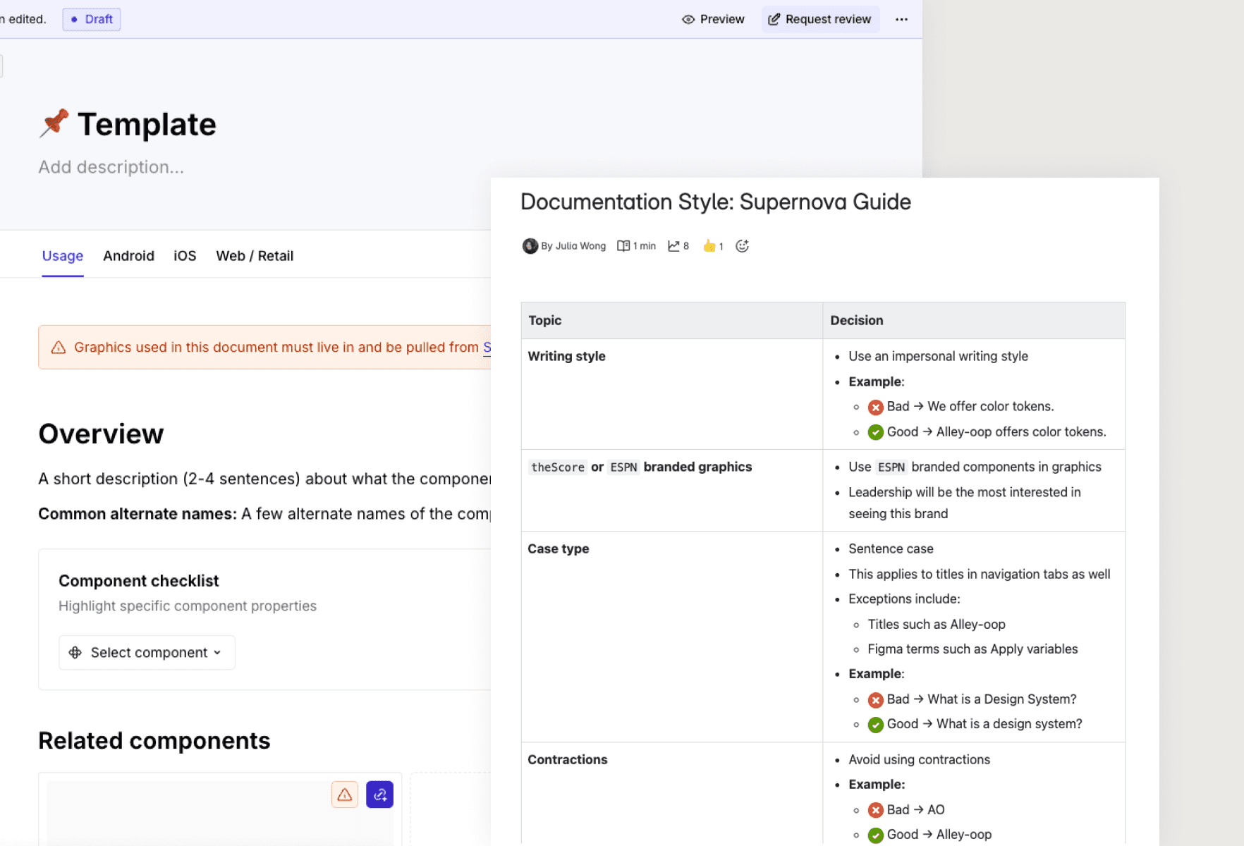
Alley-oop Doc Site
Creating consistent documentation
Maintaining consistency is difficult within a bigger team. I developed a standardized component usage template and a Confluence guide on writing style best practices. These tools streamlined the documentation process and made it easier for new contributors to follow.
Community Efforts
Design System Rituals
A design system thrives when it’s actively used and embraced across feature teams. The Alley-oop team prioritizes building strong relationships with external teams to foster trust and drive adoption. These design system rituals serve as spaces for teams to share insights, ask questions, and suggest improvements.
Design System Rituals
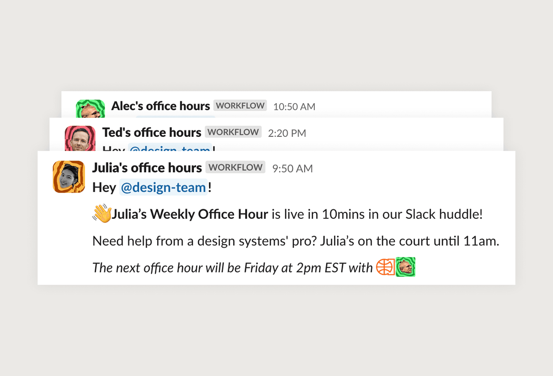
🎧 Weekly Office Hours
We hold weekly open office hours, three times a week. Designers can easily hop into the Slack huddle to ask quick questions, or jam on something together.
Design System Rituals
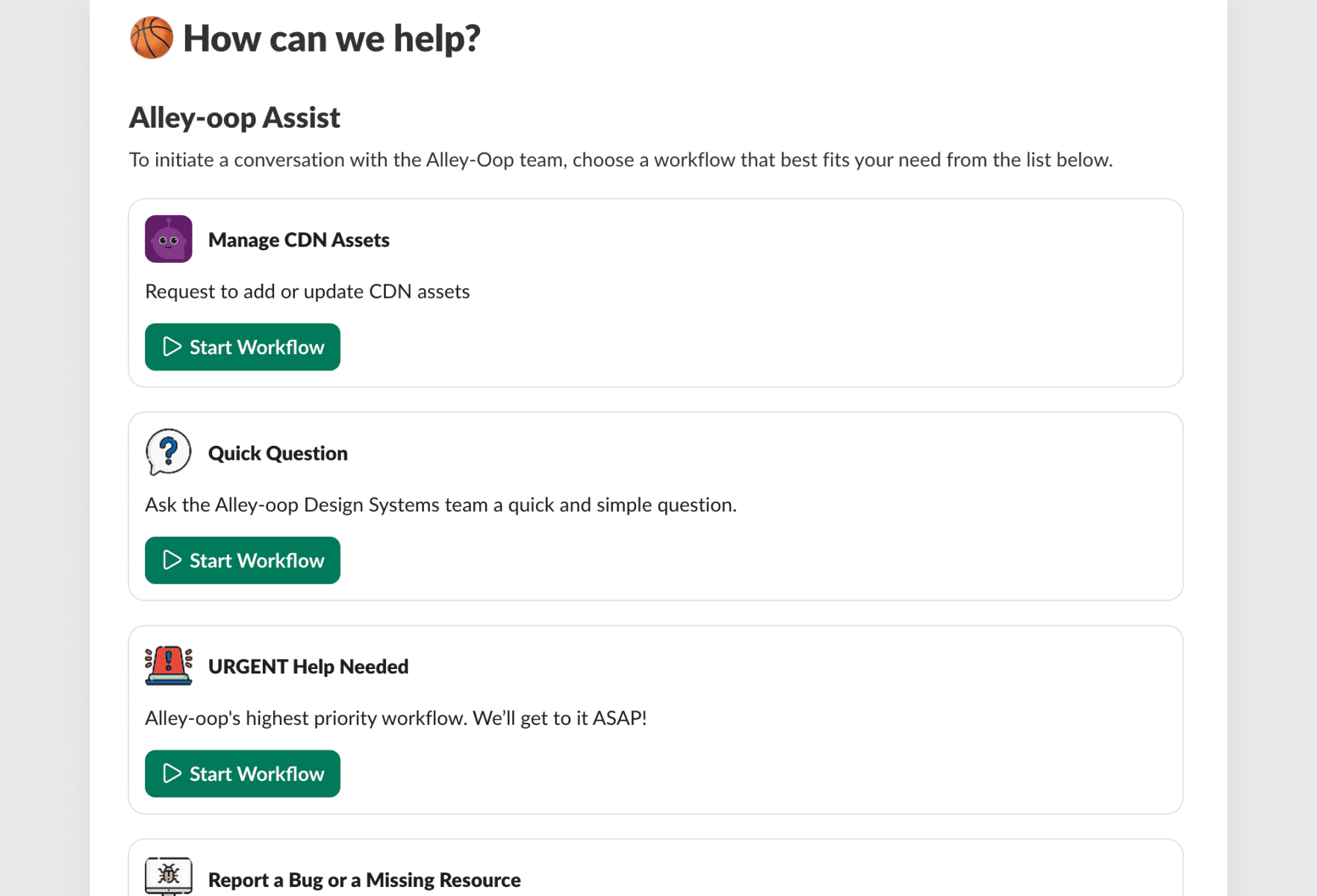
🚨 Slack Assist Workflows
In our public design systems channel, we’ve created a couple workflows where users of the system can ask quick questions, request urgent help, or request to contribute to the system.
Design System Rituals
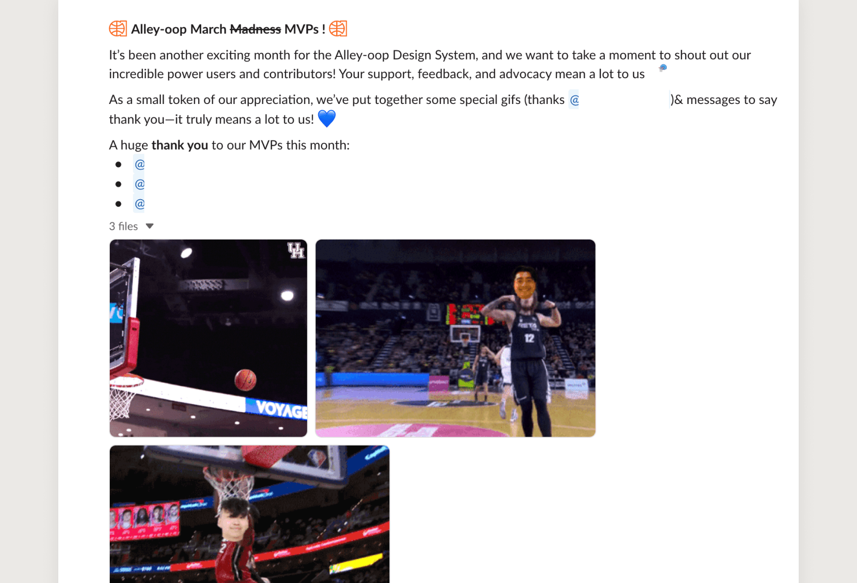
📢 Monthly Shout Outs
Each month, we recognize designers and developers who have been great pioneers of the design system. And we like to make 'em fun!
Reflection
Lessons Learned
🌎
Be generic
When naming tokens, components, or patterns, I've learned that the more generic they are, the better. Early on, we had tokens and components named after specific use cases, and those just didn't scale well.
🐢
It's okay to build slower
We often rush to get components out quickly to meet product needs. But moving too fast just led to accumulating technical debt and having to redo things later. Let's slow down, and build things right the first time.